 [660x495]
[660x670]
[660x670]
[660x620]
[660x670]
[660x601]
[660x670]
[660x670]
[660x670]
[660x670]
[660x670]
[660x670]
[660x750]
[660x934]
[660x670]
[660x670]
[660x327]
[660x335]
[660x746]
[660x540]
| [660x1173] |
[660x901]
[660x670]
[660x670]
[660x670]
[660x670]
| [660x965] |
| [660x420] |
[660x794]
[660x514]
[660x500]
[660x627]
К сожалению урок без исходников !!!
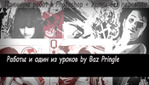
Create retro posterized illustration effects
Photoshop’s Posterized tool is shamefully underused. Here, artist Baz Pringle shows you how to rediscover its potential…
The power of posterization shouldn’t be underestimated when it comes to creating art with Photoshop. In this piece by Baz Pringle, Photoshop’s Posterize tool is used to maximum effect.
The Posterize tool allows you to specify the number of tonal levels (or brightness values) for each channel in an image, and then maps pixels to the closest matching level.
For example, choosing two tonal levels in an RGB image gives six colours – two for red, two for green, and two for blue. It’s a tool useful for creating special effects, such as large, flat areas in a photograph. It also produces interesting effects in colour images, but works best with greyscale photos.
Step 1
First of all, we need to select a photo that has an element that we want to include in our final illustration. For this example, open the original photo called ‘Scooter.jpg’ (included on the Download link on the right). Using the Lasso tool, select around the bike. We want to include some of the ground, so select some of the shadow area as well. Also, be creative and use this step to create an interesting shape, instead of a predictable cutout of just the scooter. I included some of the brick wall so as to make the profile of the shape a little more original.
Step 2
Copy the selection, then paste into a new layer. In the Layer palette, hide the Background layer. Next, select Image > Mode > Grayscale. Click on Merge when prompted. Since our ultimate goal is to simplify the image, turning it to greyscale will help us concentrate on breaking down the image into various values.
Step 3
In the next step, we’ll simplify the image into two values – black and white. Before we do this however, it helps to adjust the overall contrast and brightness of the image. This will help Photoshop distribute the values in a more satisfactory way. Select Image > Adjustments > Brightness/Contrast and enter 80 for Brightness and 100 for Contrast. These values will change depending on the original photo. For this image, these values result in the desired balance of whites and blacks, so that the image isn’t too heavily biased one way or the other.
Step 4
We now want to reduce the image to two shades, black and white. Select Image > Adjustments > Posterize and enter a value of 2. For some illustrations, I’ll use a higher number to create more shades, but for this one I want to keep the image very simple.
Step 5
Go to Select > All, and Copy. Now, open the ‘Illustration Base.psd’ file. Paste the scooter into the file, which will add a new layer. Name the new layer Scooter. Now, using the Move, Scale, and Rotate tools, position the bike to match the placement seen in the example.
Step 6
To add some interest and another level of variation to the element, select some areas inside the windshield and turn up the lightness of some of the black areas using Image > Adjustments > Hue/ Saturation. I selected the windshield because of its placement in the composition. I want the final illustration to fade away to the left, so brightening up the windshield areas will help reinforce this overall direction.
Step 7
To help blend the scooter in a bit more, we need to add some details around the edge to roughen it up and move away from the cut-&-paste look. Select the Brush Tool. In the Brush palette, select the top right arrow and then select Replace Brushes… from the dropdown menu. Select the file ‘Grafika66.abr’. This set includes some brushes that are good for adding noise and roughening up edges. It’s extremely useful to make your own brushes for specific purposes, and build up your own unique library.
Step 8
Create a new layer on top of the scooter by selecting Layer > New > and name it ‘Blend’. Now, using various of black and white, start adding brush marks around the edge of the especially on the right hand side. The aim the sharp edges created from the paste process by roughening them brushes. This also helps blend the the background and anchor it.
Step 9
This illustration has an overall aged and worn feel to it, so it’s time to do some work on degrading the scooter. Select the Scooter and Blend layers in the layer palette, then Layer > Duplicate Layers. In the pop-up window, leave the name as the default, and then select New from the Document drop-down menu, followed by OK. Crop the image so the image fills the document. Now print the file out as large as possible on an A4 page.
Step 10
This step allows us to be very creative and add some interesting details. Screw the print out up into a ball and then unfold it to create some nice creases. Be creative at this point and do anything you want to add some interest to the image. Sometimes I’ll take a pen and draw little icons and images on and around it. I may also add things like bits of sticky tape and ink splats. Just experiment and see what works.
Step 11
Before we scan the image back in to Photoshop, tear around the image staying quite close to the outline of the scooter. This will create a rough, torn edge all the way round the image. Now, place the paper on the scanner and put some dark material behind it. Black paper is ideal. We want to create a nice contrast between the positive space of the paper, and the empty space around it on the bed of the scanner. Now scan the image back into Photoshop.
Step 12
Select the Magic Wand Tool. Set the Tolerance to around 30, with Anti-Alias and Contiguous checked On. Now, click anywhere on the dark background. This is why we used a dark material behind the paper, to help the Magic Wand Tool make a nice, clean selection. Now we need to invert the selection by selecting Select > Inverse. Now copy the selection.
Step 13
Click on the Illustration Base file and make sure that the Blend layer is selected. Paste the image we previously copied on top of the scooter. Using the Move, Rotate, and Scale tools, adjust the layer so that the image approximately covers the scooter below. It doesn’t have to be exact, just close. In fact, a slight misalignment in the layers will help with the rough look we’re going for. Select ‘Luminosity’ for the layer’s blending mode, and an opacity of 37 per cent.
Step 14
We now want to add a hue shift over the entire image. This will help bring all the elements together and also add a slightly aged appearance. Click on the foreground swatch and select a very bright green. Select OK to close. Now select the background swatch and select a very bright orange. Select OK to close again.
Step 15
Create a new layer on top of all the others. Select the Gradient Tool and make sure that Linear Gradient (the default) is selected from the tool’s options. Now left-click in the top left of the composition, drag to the bottom right, then release the mouse button.
Step 16
In the Layer Palette window, select the drop-down for the Blending Mode and select Color. Set the opacity to 11 per cent to add a light wash of colour to the whole image. It really pays to try each mode to see what interesting results you can achieve. Remember to experiment along the way and develop your own techniques. You’ll end up creating your own arsenal of processes that will help you add that extra level of originality to your work. Baz Pringle