Без заголовка
22-12-2008 19:28
к комментариям - к полной версии
- понравилось!
Это цитата сообщения lj_icon_tutorial Оригинальное сообщение
2 tutorials made in PS7
I got asked for a tutorial explaining how to make this kind of icons, so here we go.
I brought you two examples (:
FIRST ONE.
how to get this.
1- open your picture, select and copy the part you're interested in
 [показать]
2- copy it into a new file (100px X 100px). I chose as my background the color #F3F3F3.
[показать]
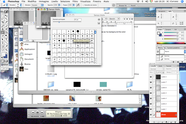
3-start erasing the picture. I used a small brush *screencap*
[показать]
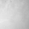
4- when you're done, start playing with textures. I used some black and white textures, I set them to multiply and erased some parts.
(es. this and this ones)
[показать]
5- I filled a new layer with the color #2D2D2D and set it to exclusion.
6- added some new textures (the text thing and the moon).
et voila!
my result
[показать]
it's very easy. once you have learnt how to erase parts and stuff, it's really up to your creativity of mixing textures : D
other examples
[показать] [показать] [показать]
SECOND ONE.
how to get this.
1- open your picture, select and copy the part you're interested in and paste it into a new file 100x100. pick your background and sharpen if needed.
[показать]
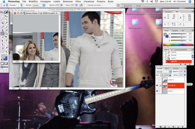
2- start erasing the picture. I suggest using a small brush *screencap*
[показать]
3- fill a new layer with #180B01 and set it to exclusion.
4- Color balance layer
midtones: +10, 0, -9
shadows: +11, 0, +17
highlights: +10; 0; -7
5. Selective color layer.
reds: -42, 0, +44, +26
yellows: -32, 0, +16, +30
whites: +22, -23, -51, +100
neutrals: 0, 0, 0, -20
blacks: 0, 0, 0, +17
6. Selective color layer.
reds: -32, 0, +52, +32
yellows: -15, -37, -58, +21
whites: 0, 0, 0, +35
neutrals: 0, 0, -15, 0
7. Hue/sat layer.
master: 0, 10, 0
yellows: 0, -49, 0
magenta: 0, -34, 0
[показать]
8. add and play with textures! : D
I added this one and set it to screen %40 and erased some parts.
then this one and set it to multiply %38
9. Selective color layer.
reds: -8, 0, 0, +10
10. I added this texture, erased some parts and set it to normal %46
add another texture set to color burn
11. Brightness/contrast
brightness: +2
contrast: + 4
12. fill a new layer with #180B01 and set it to exclusion. fill another layer with the same color and set it to exclusion %32
13. Hue/sat layer.
master: 0, 15, 0
and you're done! PSD DOWNLOAD HERE.
[показать]
some other results
[показать] [показать] [показать]
it wasn't difficult, right? : D
I'd love to see ur results ^_____^
you like what you see? you can friend me ^______^
вверх^
к полной версии
понравилось!
в evernote
Это цитата сообщения lj_icon_tutorial Оригинальное сообщение
2 tutorials made in PS7
I got asked for a tutorial explaining how to make this kind of icons, so here we go.
I brought you two examples (:
FIRST ONE.
how to get this.
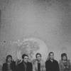
1- open your picture, select and copy the part you're interested in
[показать]2- copy it into a new file (100px X 100px). I chose as my background the color #F3F3F3.
[показать]3-start erasing the picture. I used a small brush *screencap*
 [показать]
4- when you're done, start playing with textures. I used some black and white textures, I set them to multiply and erased some parts.
(es. this and this ones)
 [показать]
5- I filled a new layer with the color #2D2D2D and set it to exclusion.
6- added some new textures (the text thing and the moon).
et voila!
my result
[показать]it's very easy. once you have learnt how to erase parts and stuff, it's really up to your creativity of mixing textures : D
other examples
[показать] [показать] [показать]SECOND ONE.
how to get this.
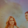
1- open your picture, select and copy the part you're interested in and paste it into a new file 100x100. pick your background and sharpen if needed.
[показать]2- start erasing the picture. I suggest using a small brush *screencap*
 [показать]
3- fill a new layer with #180B01 and set it to exclusion.
4- Color balance layer
midtones: +10, 0, -9
shadows: +11, 0, +17
highlights: +10; 0; -7
5. Selective color layer.
reds: -42, 0, +44, +26
yellows: -32, 0, +16, +30
whites: +22, -23, -51, +100
neutrals: 0, 0, 0, -20
blacks: 0, 0, 0, +17
6. Selective color layer.
reds: -32, 0, +52, +32
yellows: -15, -37, -58, +21
whites: 0, 0, 0, +35
neutrals: 0, 0, -15, 0
7. Hue/sat layer.
master: 0, 10, 0
yellows: 0, -49, 0
magenta: 0, -34, 0
[показать]8. add and play with textures! : D
I added this one and set it to screen %40 and erased some parts.
then this one and set it to multiply %38
9. Selective color layer.
reds: -8, 0, 0, +10
10. I added this texture, erased some parts and set it to normal %46
add another texture set to color burn
11. Brightness/contrast
brightness: +2
contrast: + 4
12. fill a new layer with #180B01 and set it to exclusion. fill another layer with the same color and set it to exclusion %32
13. Hue/sat layer.
master: 0, 15, 0
and you're done! PSD DOWNLOAD HERE.
[показать]some other results
[показать] [показать] [показать]it wasn't difficult, right? : D
you like what you see? you can friend me ^______^
http://community.livejournal.com/icon_tutorial/10002234.html
Вы сейчас не можете прокомментировать это сообщение.
Дневник Без заголовка | Valery_Williams - закрыт |
Лента друзей Valery_Williams
/ Полная версия
Добавить в друзья
Страницы:
раньше»